
Briefs & Challenges
With the emphasis very much on usability and improved navigation, suggestions were made after the initial requirements from the client had been met. These ideas came together to build a clear plan of how to go about building the site so it was fresh, clean and easy to use.
Solutions
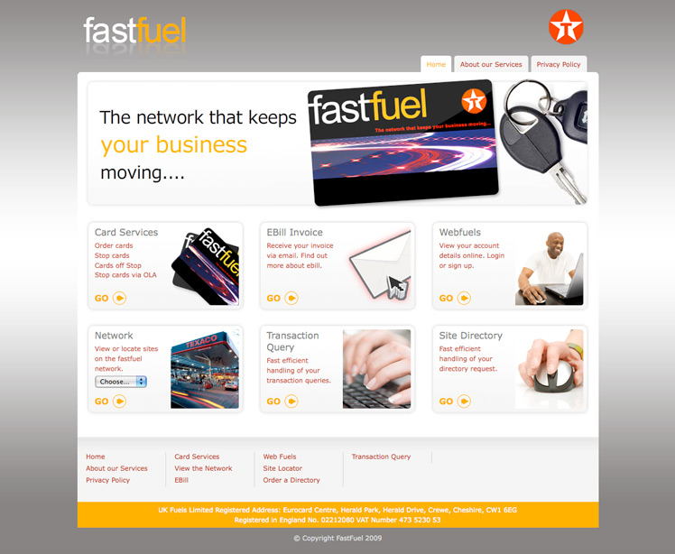
The branding of the card was extremely important in the design. The old site felt quite crowded, with attention being drawn to the wrong areas. A new flash animation was proposed for the front page, to make the brand more attractive.
The navigation system and clean form designs throughout the site needed to keep people interested in the whole experience, hopefully motivating more customers to sign up.
Results
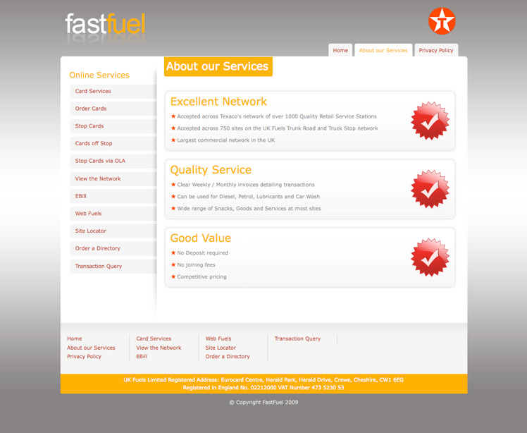
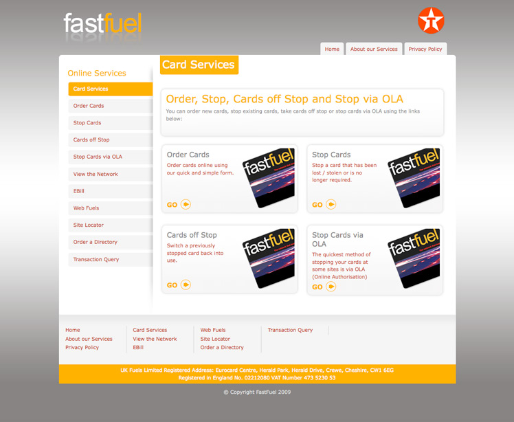
A web site which flows seamlessly, with clear hand-holding through each step. Pointers and subtle messages provide them with the kind of guidance designed to make the site easy to use. The User Interface was built using a mixture of fully formed semantic XHTML markup and the jQuery javascript framework. All of the main services of the web site appear on the home page to allow for one click access.
A detailed and attractive design of the main areas of the site such as the navigation system and forms are presented to make the structure of the site more accessible; building these areas was a challenge but one achieved, creating the most striking features of the design.
The back end system was implemented with the Perl Catalyst framework; this modern, flexible MVC (Model, View, Controller) framework enforces good coding practices, and provides easy maintenance for future content changes or additions. Parts of the system are integrated into the jQuery framework to provide the front end with more appeal.